
Digital

Digital
Colors
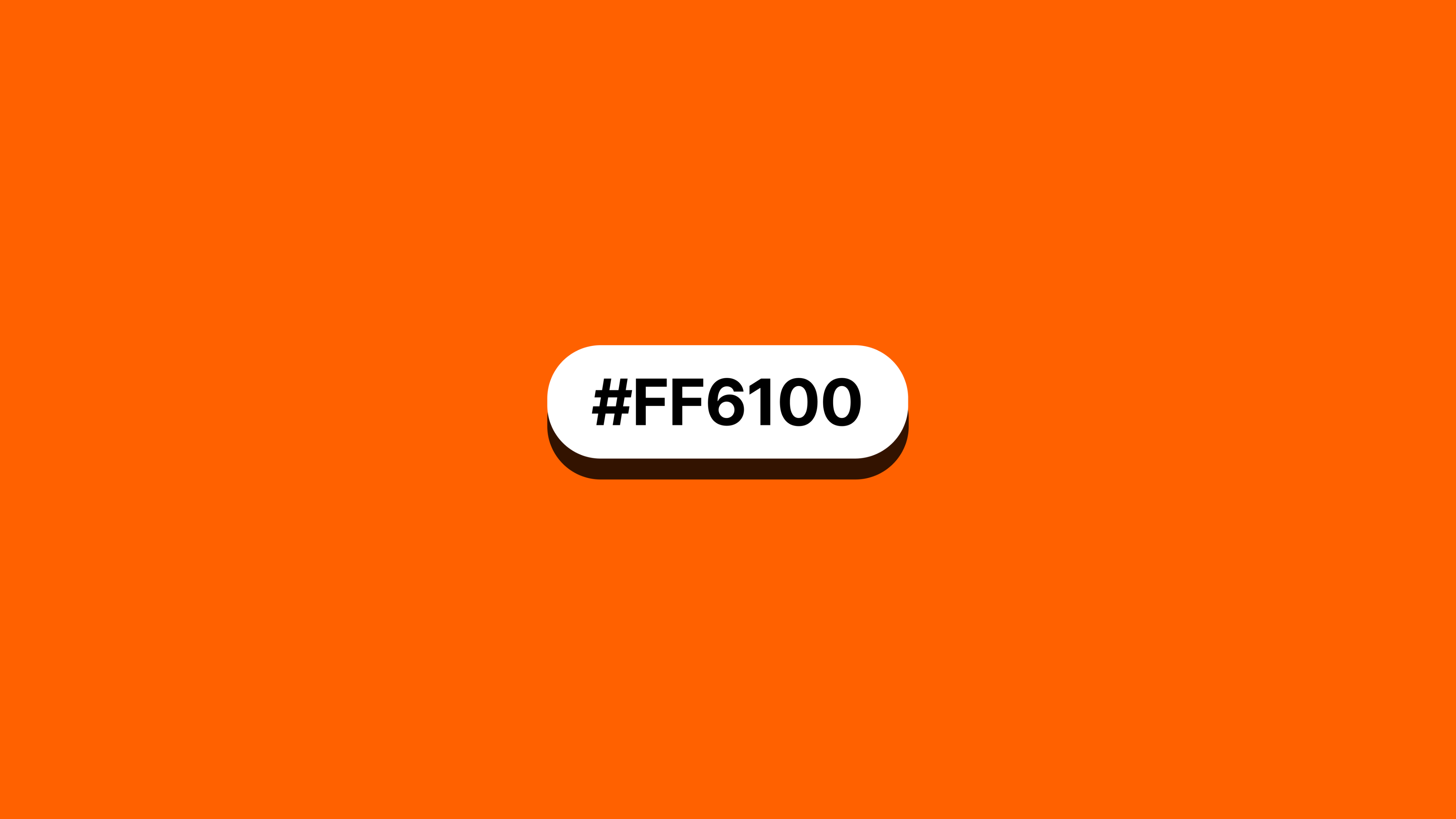
Ria Orange is central to our visual identity, capturing the energy and recognition of our brand. As a consistent thread across all touchpoints, it ensures a cohesive experience. Its versatility supports a range of expressions, from bold to inviting.

Primary palette
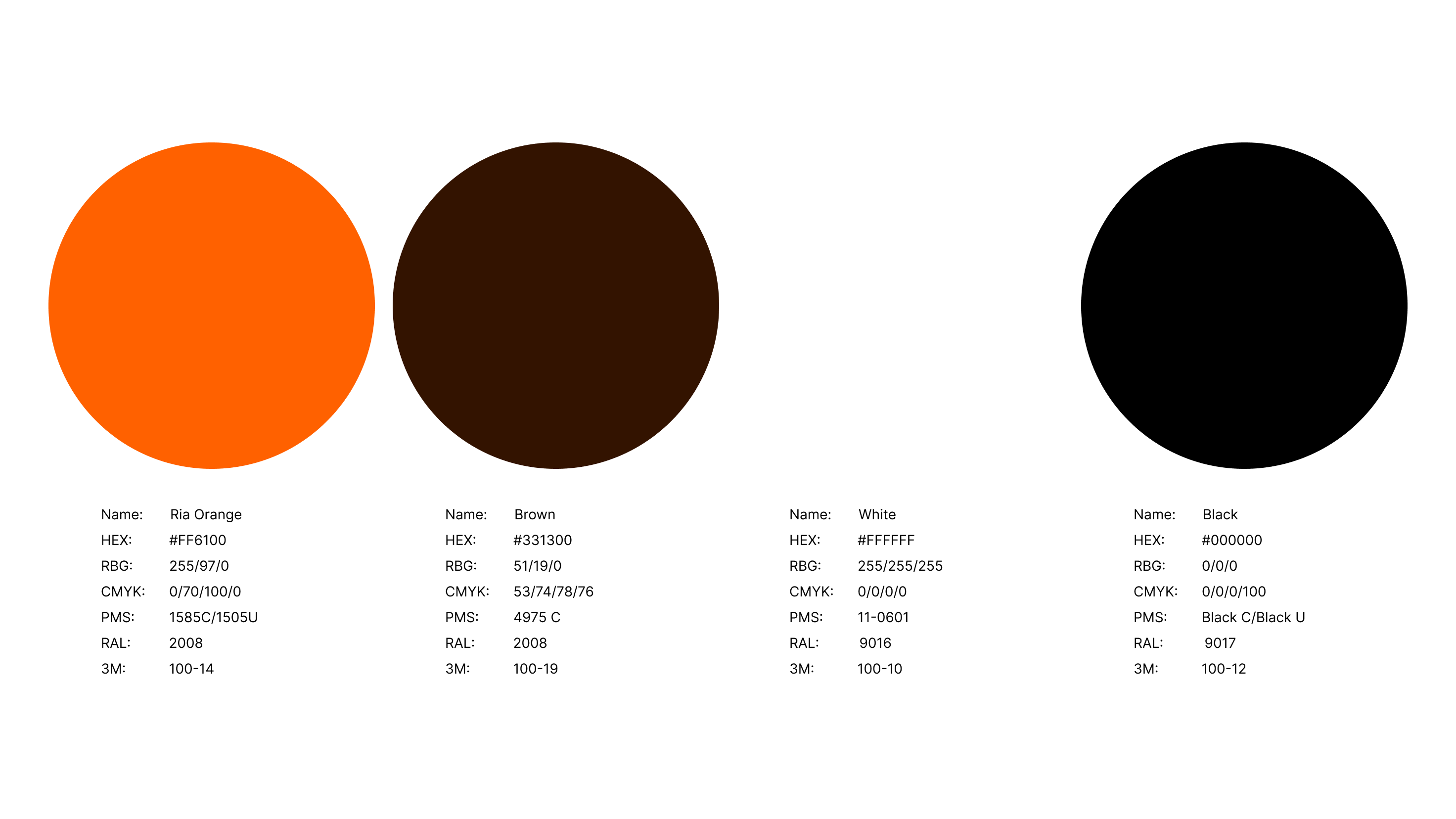
Ria Orange is central to our brand identity and should be present across all touch points in a way that feels intentional. While bold applications can make a statement, its use should go beyond the obvious — integrating depth, balance, and creativity. Black, White, and Brown act as grounding elements, providing contrast and sophistication. Every application should feel sophisticated, purposeful, and unmistakably Ria.
Tints and shades
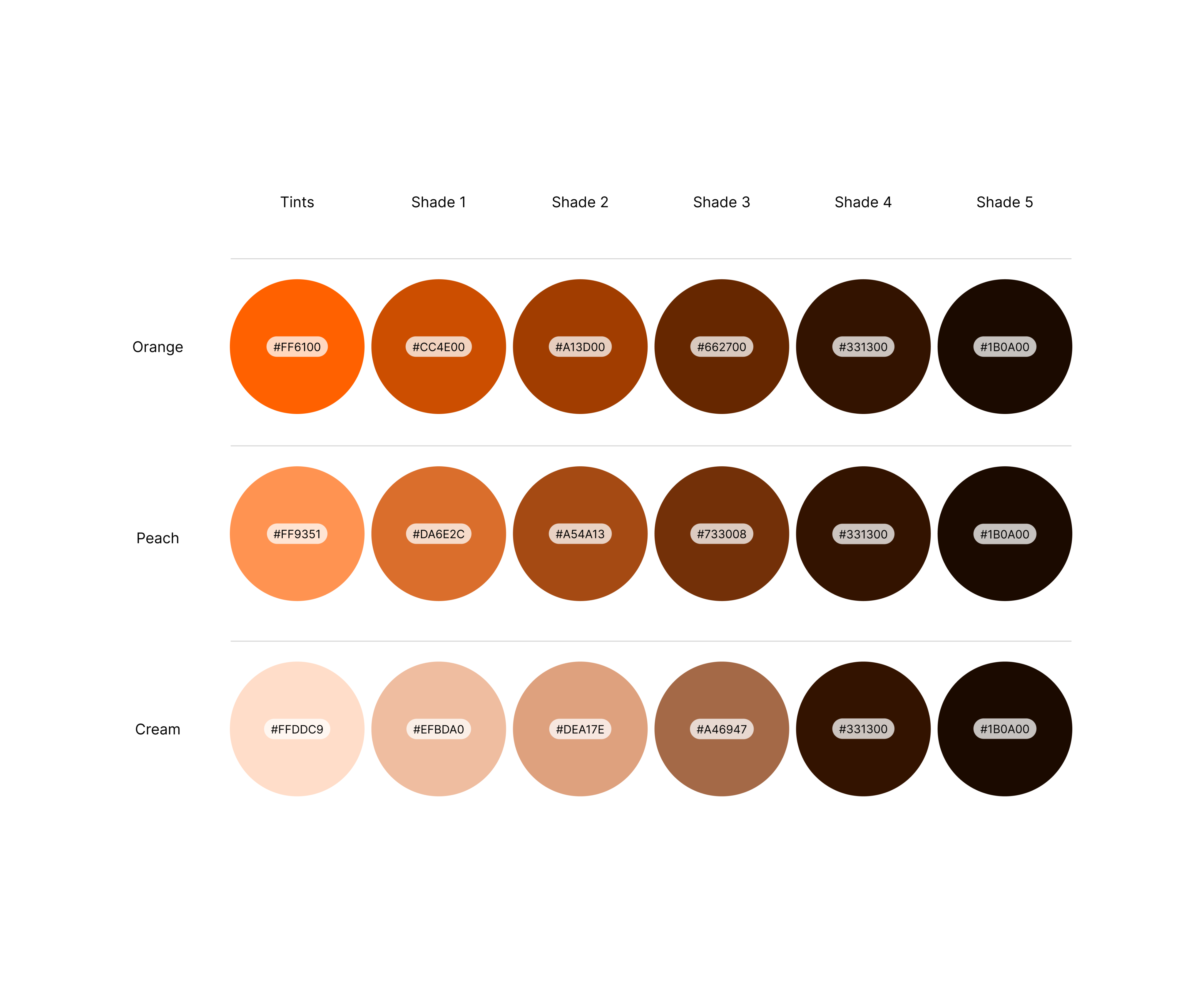
The tints and shades of Ria Orange add significant variety to the primary palette, expanding the color range for more nuanced design work. These variations are primarily used by specialists such as designers, illustrators, animators, and creative directors who know how to apply them effectively. They allow for more depth and flexibility, enabling specialists to fine-tune colors for different applications.
Usage limited to designers, illustrators and animators
Color modes
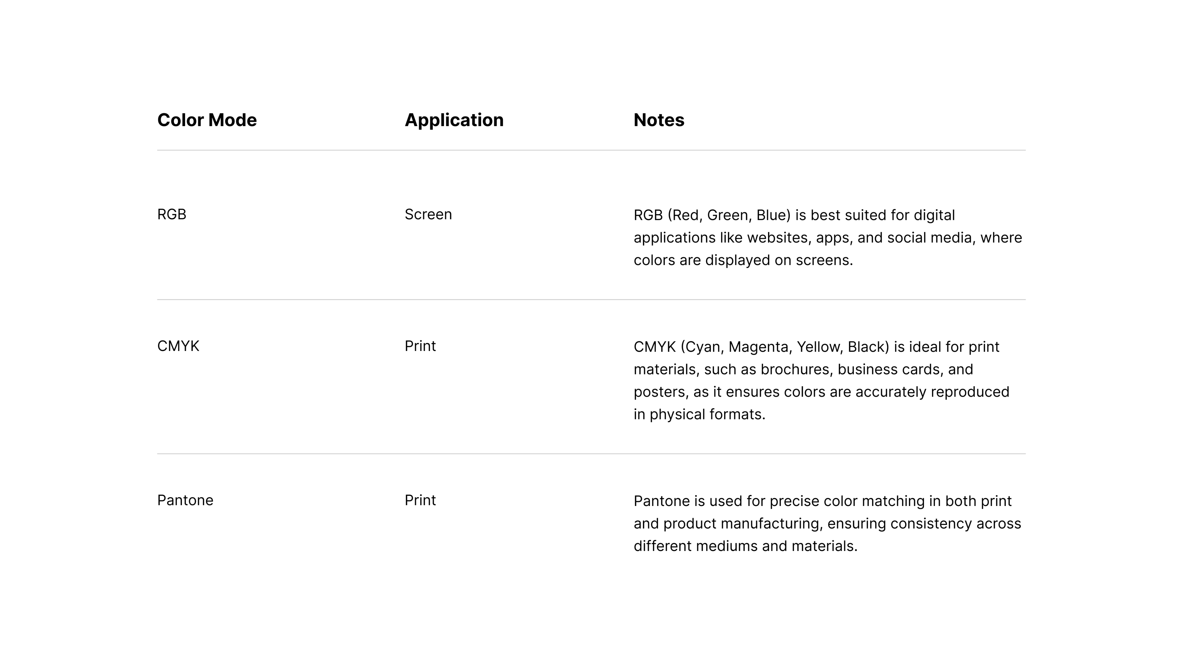
Understanding color modes is essential for ensuring that our designs translate accurately across different mediums. Whether it's for print or digital, selecting the right color mode ensures consistency and visual impact wherever the Ria brand appears.
Accessibility
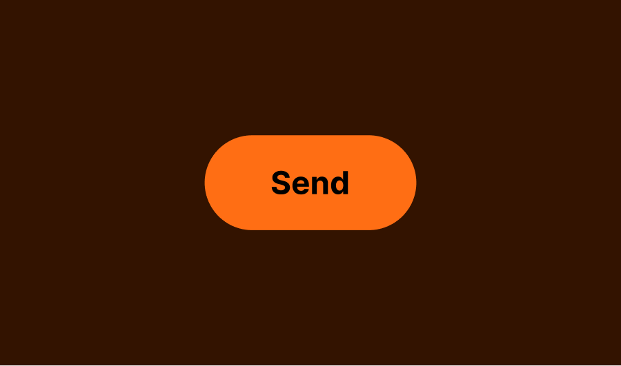
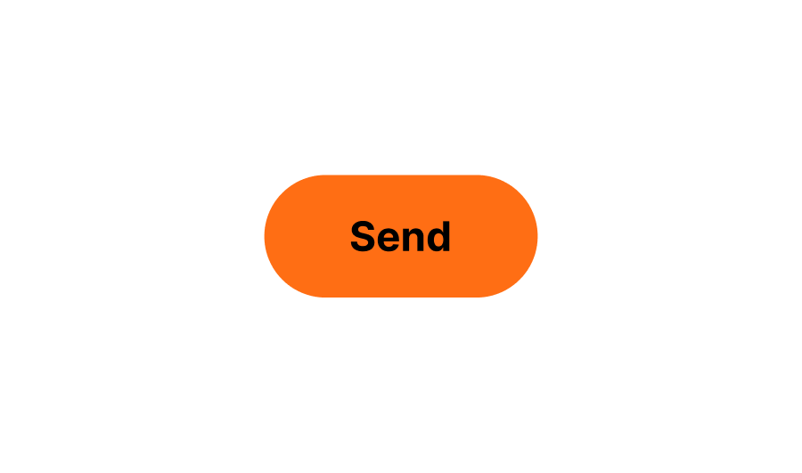
Accessibility is essential in all design applications, with visibility and legibility being the key focus. The easiest way to ensure accessibility is by maintaining proper contrast ratios between foreground and background colors. Whenever possible, aim for higher contrast to enhance readability and inclusivity across all brand touch points.
Text
Orange Text


Brown Text


White Text


Black Text


CTA
Orange

Brown


White


Black


Incorrect usage
Avoid the following treatments.

Don’t use the wrong color


Don’t eyedrop Hex values

Don’t make new tints/shades

Colors
Ria Orange is central to our visual identity, capturing the energy and recognition of our brand. As a consistent thread across all touchpoints, it ensures a cohesive experience. Its versatility supports a range of expressions, from bold to inviting.

Primary palette
Ria Orange is central to our brand identity and should be present across all touch points in a way that feels intentional. While bold applications can make a statement, its use should go beyond the obvious — integrating depth, balance, and creativity. Black, White, and Brown act as grounding elements, providing contrast and sophistication. Every application should feel sophisticated, purposeful, and unmistakably Ria.
Tints and shades
The tints and shades of Ria Orange add significant variety to the primary palette, expanding the color range for more nuanced design work. These variations are primarily used by specialists such as designers, illustrators, animators, and creative directors who know how to apply them effectively. They allow for more depth and flexibility, enabling specialists to fine-tune colors for different applications.
Usage limited to designers, illustrators and animators
Color modes
Understanding color modes is essential for ensuring that our designs translate accurately across different mediums. Whether it's for print or digital, selecting the right color mode ensures consistency and visual impact wherever the Ria brand appears.
Accessibility
Accessibility is essential in all design applications, with visibility and legibility being the key focus. The easiest way to ensure accessibility is by maintaining proper contrast ratios between foreground and background colors. Whenever possible, aim for higher contrast to enhance readability and inclusivity across all brand touch points.
Text
Orange Text
Brown Text
White Text
Black Text
CTA
Orange
Brown
White
Black
Incorrect usage
Avoid the following treatments.
Don’t use the wrong color
Don’t eyedrop Hex values
Don’t make new tints/shades
Colors
Ria Orange is central to our visual identity, capturing the energy and recognition of our brand. As a consistent thread across all touchpoints, it ensures a cohesive experience. Its versatility supports a range of expressions, from bold to inviting.

Primary palette
Ria Orange is central to our brand identity and should be present across all touch points in a way that feels intentional. While bold applications can make a statement, its use should go beyond the obvious — integrating depth, balance, and creativity. Black, White, and Brown act as grounding elements, providing contrast and sophistication. Every application should feel sophisticated, purposeful, and unmistakably Ria.
Tints and shades
The tints and shades of Ria Orange add significant variety to the primary palette, expanding the color range for more nuanced design work. These variations are primarily used by specialists such as designers, illustrators, animators, and creative directors who know how to apply them effectively. They allow for more depth and flexibility, enabling specialists to fine-tune colors for different applications.
Usage limited to designers, illustrators and animators
Color modes
Understanding color modes is essential for ensuring that our designs translate accurately across different mediums. Whether it's for print or digital, selecting the right color mode ensures consistency and visual impact wherever the Ria brand appears.
Accessibility
Accessibility is essential in all design applications, with visibility and legibility being the key focus. The easiest way to ensure accessibility is by maintaining proper contrast ratios between foreground and background colors. Whenever possible, aim for higher contrast to enhance readability and inclusivity across all brand touch points.
Text
Orange text
Brown text
White text
Black text
CTA
Orange
Brown
White
Black
Incorrect usage
Avoid the following treatments.
Don’t use the wrong color
Don’t eyedrop Hex values
Don’t make new tints/shades