
Digital

Digital
Typography
Our typography is designed to strike a balance between structure and creativity, ensuring clarity across all sizes and languages. It allows for expressive and unconventional uses that bring our brand to life.

Typeface
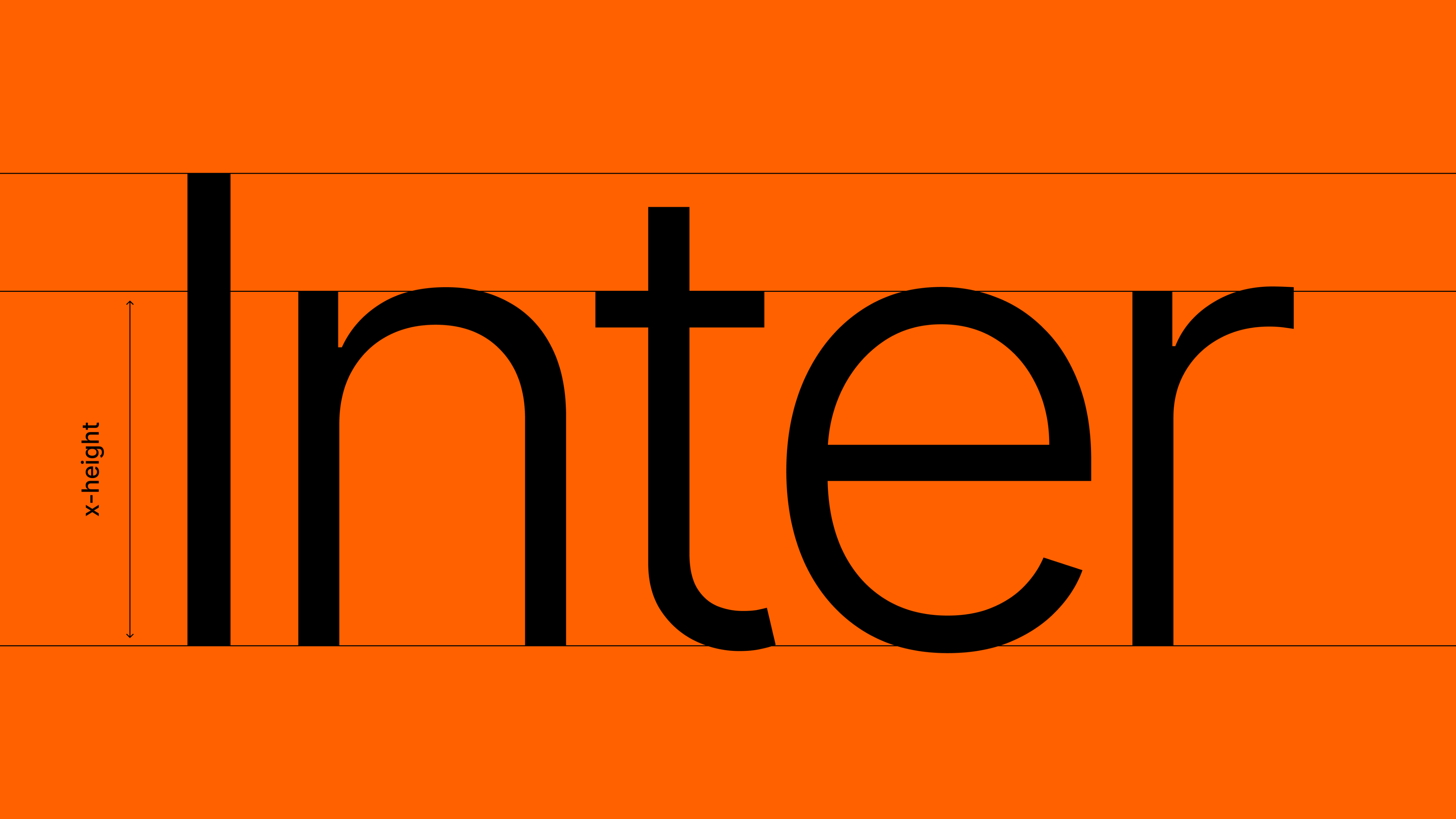
Ria uses Inter, a versatile sans-serif typeface crafted for excellent readability in both digital and print formats. Featuring a tall x-height, a wide range of weights, extensive language support, and advanced OpenType features, Inter delivers clarity across interfaces and marketing materials.
Weights
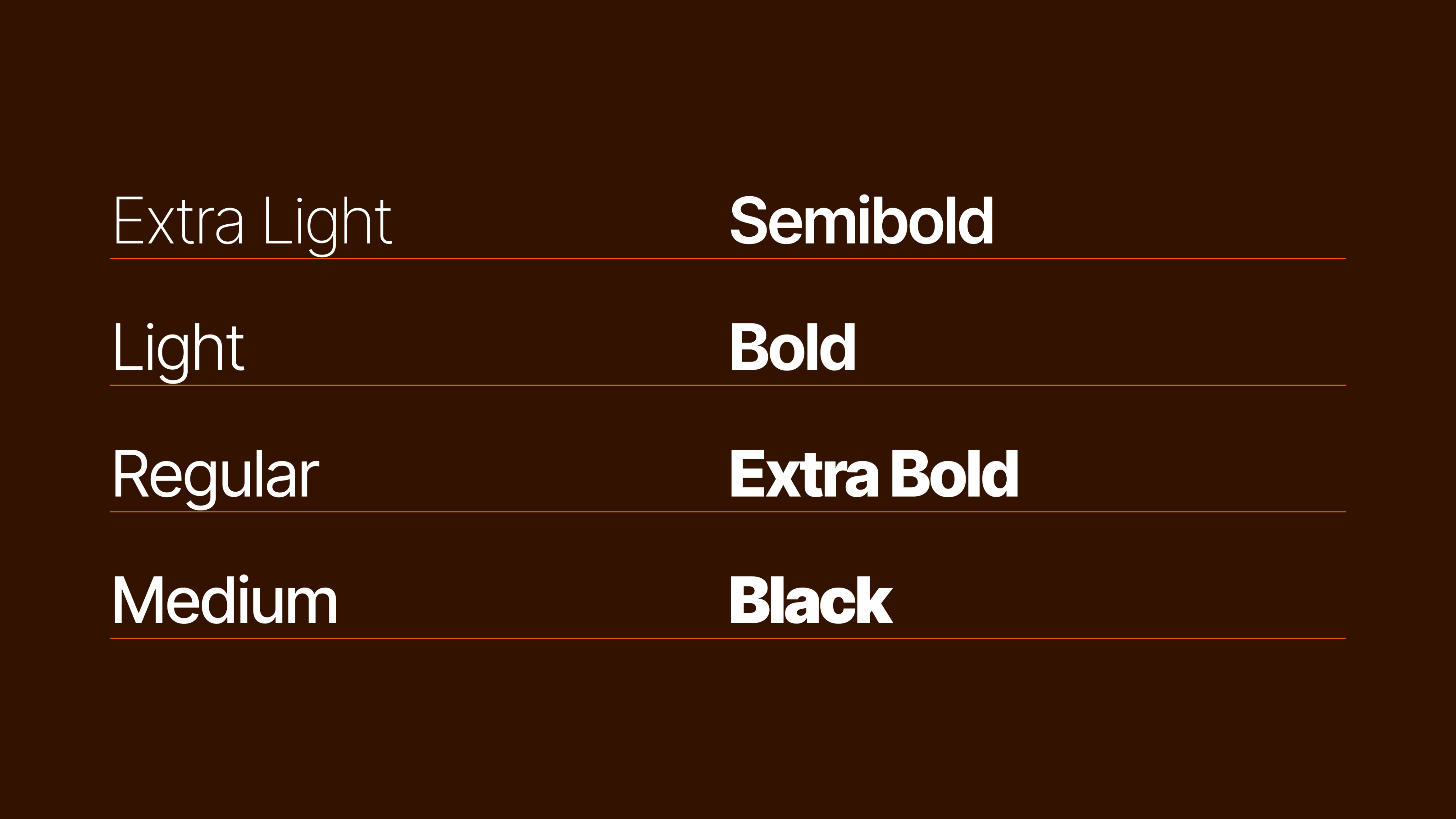
Inter offers a wide range of weights, which allows Ria the flexibility to create strong typographic hierarchies and dynamic layouts across all materials.
Casing
Effective casing enhances readability and impact — sentence case keeps text approachable, while title case adds emphasis to key phrases.
Usage limited to designers, illustrators and animators
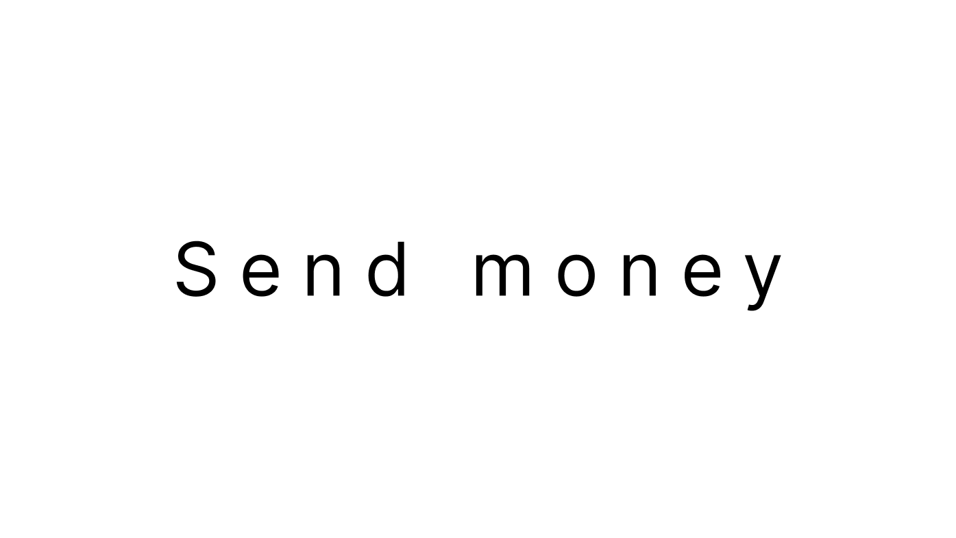
Use sentence casing for most things. Any weight from Inter.
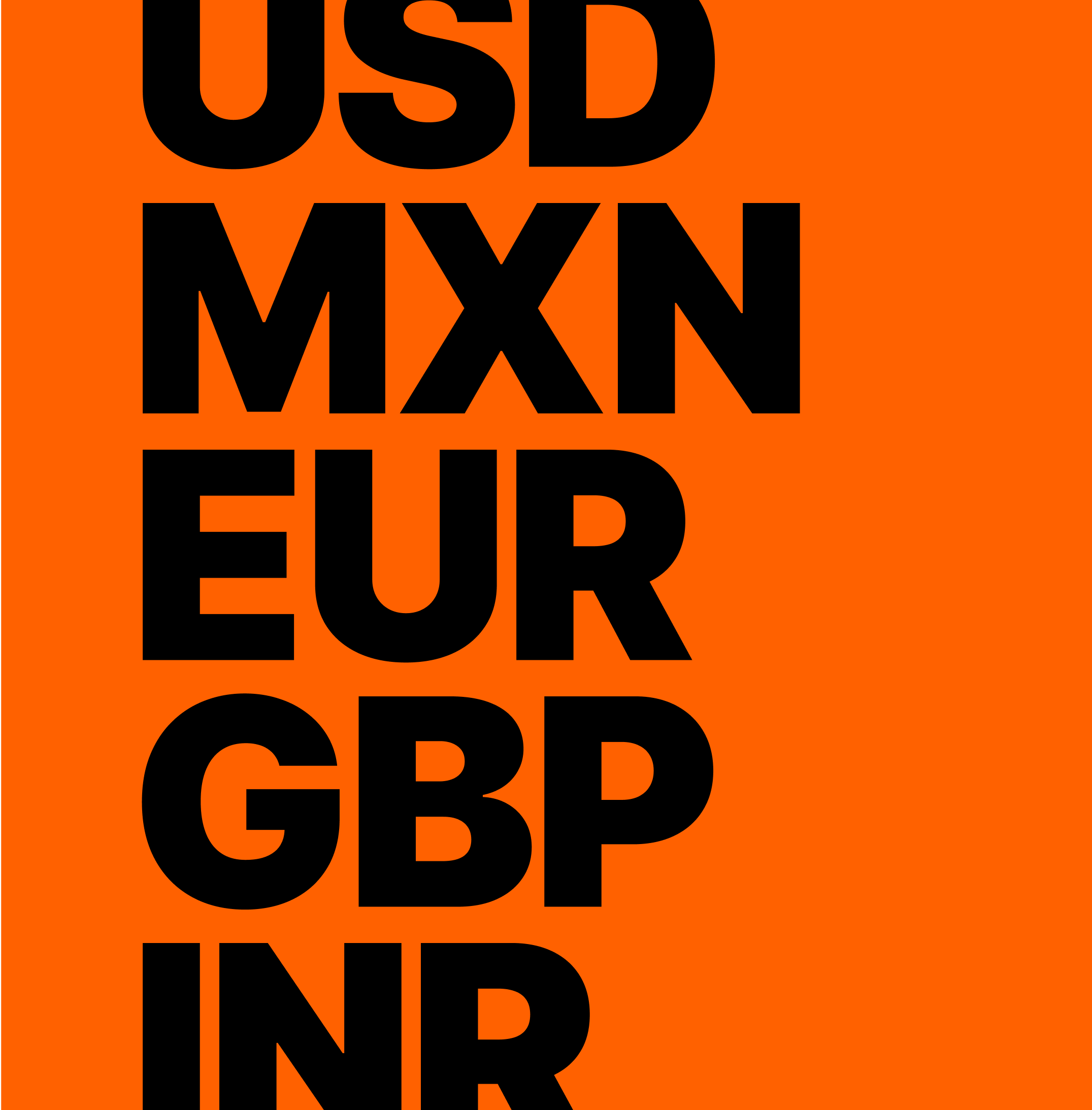
Use title casing for short phrases to create high impact. (only Inter Black)
Languages
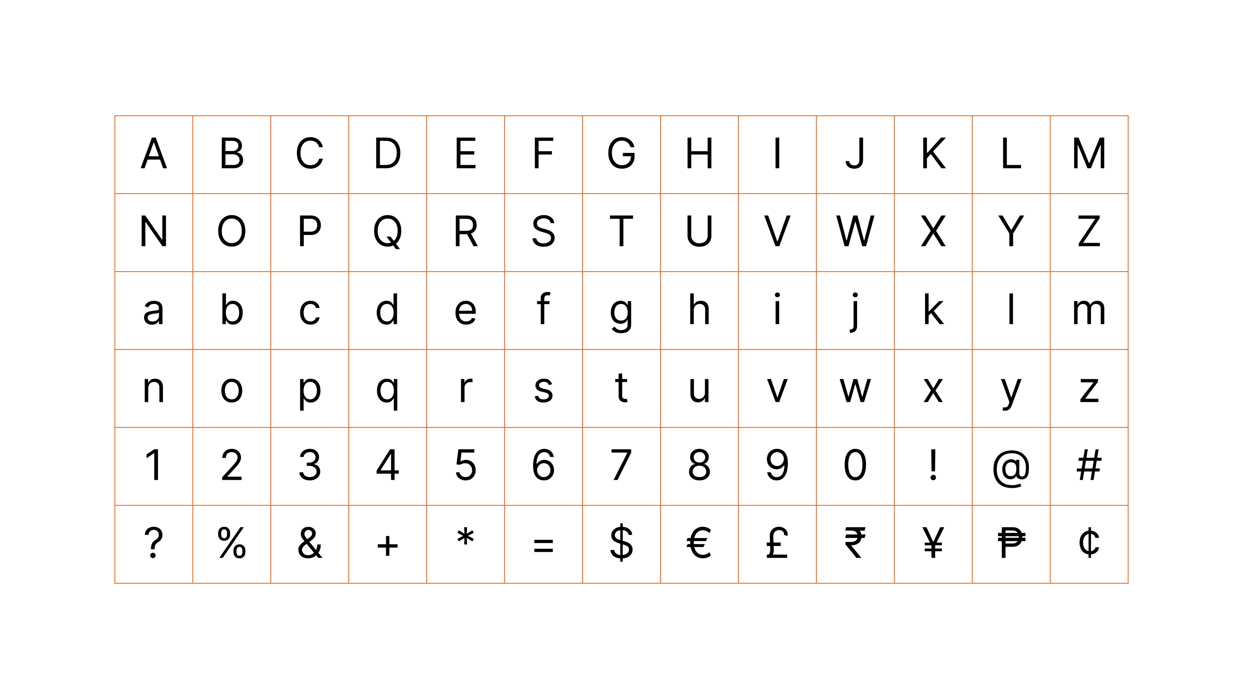
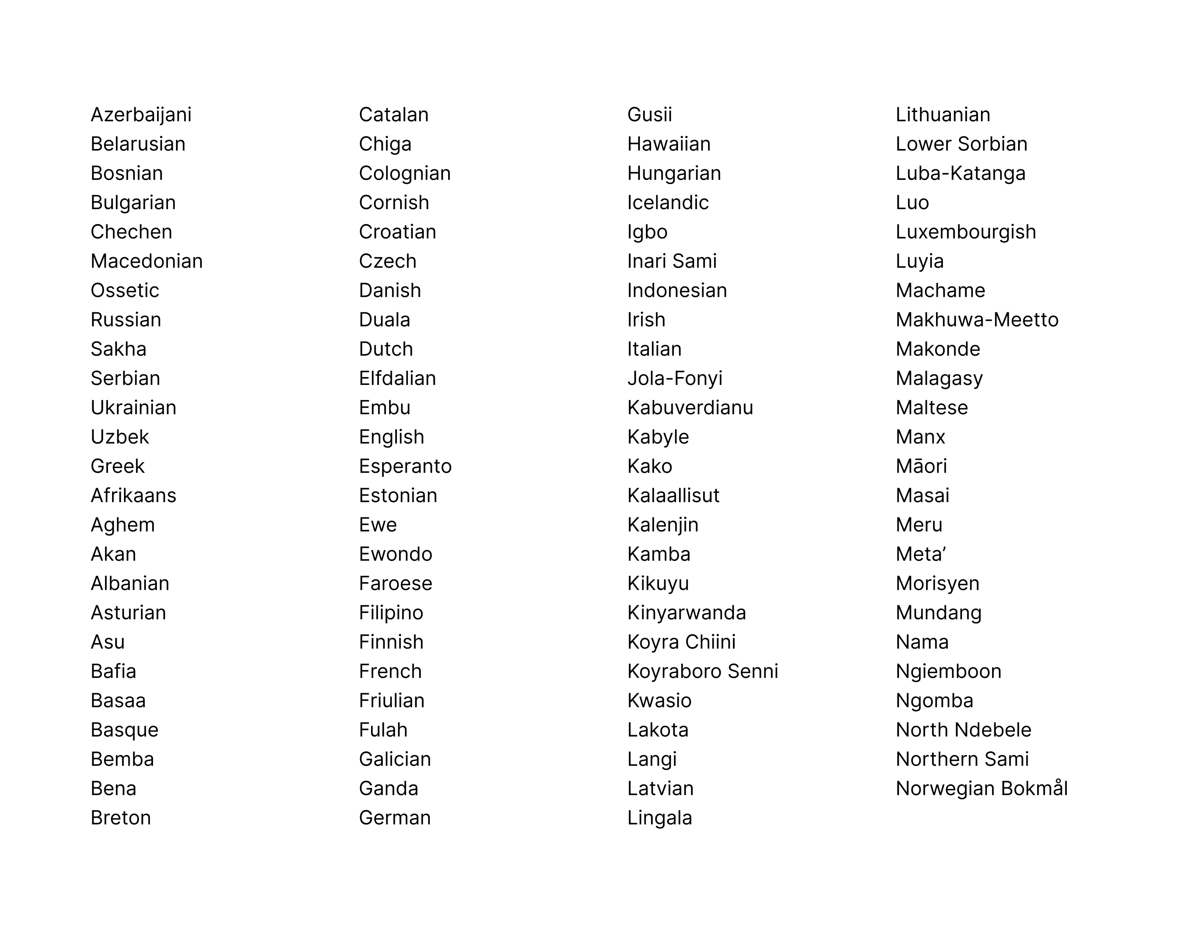
Inter offers robust language support, ensuring clarity and consistency across Ria’s global audience. With its extensive character set for both Western and Eastern European languages, it keeps content visually cohesive and accessible, reinforcing our commitment to inclusivity worldwide.
Examples
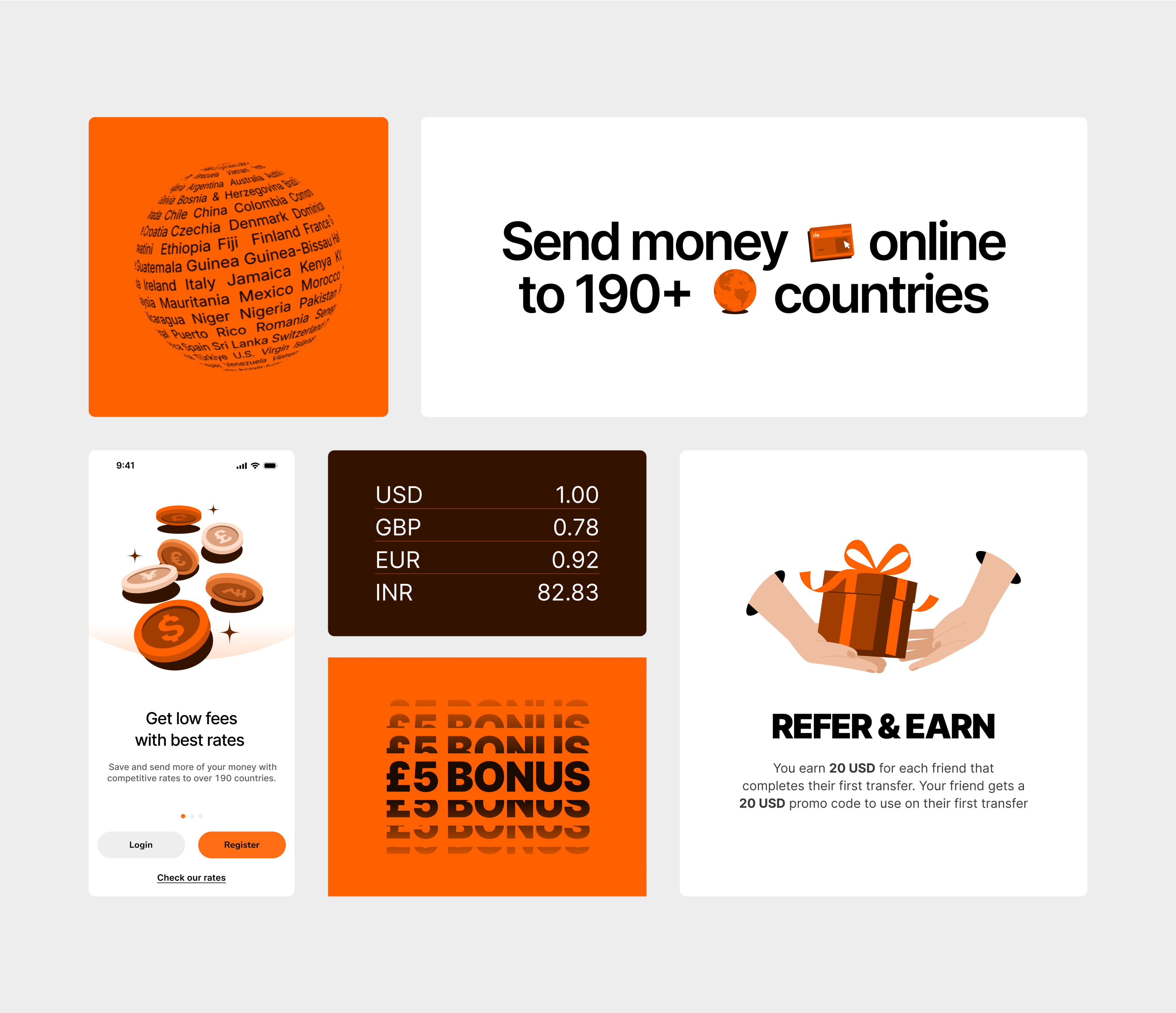
Examples of Inter include bold and creative use cases in marketing, along with readable body text in product. The versatile weights and clean design ensure a cohesive, consistent experience, enhancing accessibility and communication across all platforms.
Incorrect usage
Our typographic system offers considerable flexibility and creative freedom, but certain guidelines must be followed to maintain consistency and thoughtful typesetting. Please avoid the following.
Don’t use other typefaces

Don’t kern
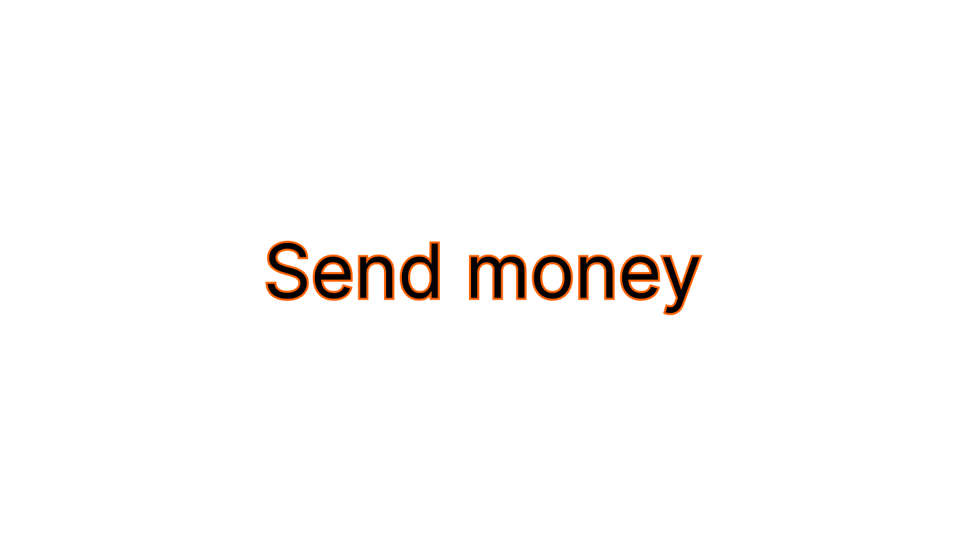
Don’t add any effects
Typography
Our typography is designed to strike a balance between structure and creativity, ensuring clarity across all sizes and languages. It allows for expressive and unconventional uses that bring our brand to life.

Typeface
Ria uses Inter, a versatile sans-serif typeface crafted for excellent readability in both digital and print formats. Featuring a tall x-height, a wide range of weights, extensive language support, and advanced OpenType features, Inter delivers clarity across interfaces and marketing materials.
Weights
Inter offers a wide range of weights, which allows Ria the flexibility to create strong typographic hierarchies and dynamic layouts across all materials.
Casing
Effective casing enhances readability and impact — sentence case keeps text approachable, while title case adds emphasis to key phrases.
Usage limited to designers, illustrators and animators
Use sentence casing for most things. Any weight from Inter.
Use title casing for short phrases to create high impact. (only Inter Black)
Languages
Inter offers robust language support, ensuring clarity and consistency across Ria’s global audience. With its extensive character set for both Western and Eastern European languages, it keeps content visually cohesive and accessible, reinforcing our commitment to inclusivity worldwide.
Examples
Examples of Inter include bold and creative use cases in marketing, along with readable body text in product. The versatile weights and clean design ensure a cohesive, consistent experience, enhancing accessibility and communication across all platforms.
Incorrect usage
Our typographic system offers considerable flexibility and creative freedom, but certain guidelines must be followed to maintain consistency and thoughtful typesetting. Please avoid the following.
Don’t use other typefaces
Don’t kern
Don’t add any effects

Typography
Our typography is designed to strike a balance between structure and creativity, ensuring clarity across all sizes and languages. It allows for expressive and unconventional uses that bring our brand to life.


Typeface
Ria uses Inter, a versatile sans-serif typeface crafted for excellent readability in both digital and print formats. Featuring a tall x-height, a wide range of weights, extensive language support, and advanced OpenType features, Inter delivers clarity across interfaces and marketing materials.
Download Inter from Google Fonts
Weights
Inter offers a wide range of weights, which allows Ria the flexibility to create strong typographic hierarchies and dynamic layouts across all materials.

Casing
Effective casing enhances readability and impact — sentence case keeps text approachable, while title case adds emphasis to key phrases.
Usage limited to designers, illustrators and animators
Use sentence casing for most things. Any weight from Inter.
Use title casing for short phrases to create high impact. (only Inter Black)
Languages
Inter offers robust language support, ensuring clarity and consistency across Ria’s global audience. With its extensive character set for both Western and Eastern European languages, it keeps content visually cohesive and accessible, reinforcing our commitment to inclusivity worldwide.
Examples
Examples of Inter include bold and creative use cases in marketing, along with readable body text in product. The versatile weights and clean design ensure a cohesive, consistent experience, enhancing accessibility and communication across all platforms.
Incorrect usage
Our typographic system offers considerable flexibility and creative freedom, but certain guidelines must be followed to maintain consistency and thoughtful typesetting. Please avoid the following.
Don’t use other typefaces
Don’t kern
Don’t add any effects