
Digital

Digital
Logo
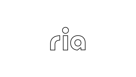
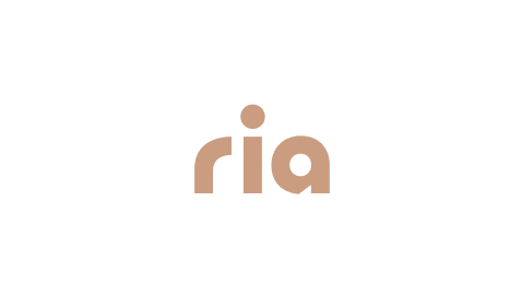
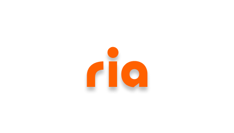
The Ria logo is our key asset and, above all other design assets, the most recognizable. It balances simplicity for good legibility, personality to create recognition and boldness to live in a wide variety of environments.
Download logos

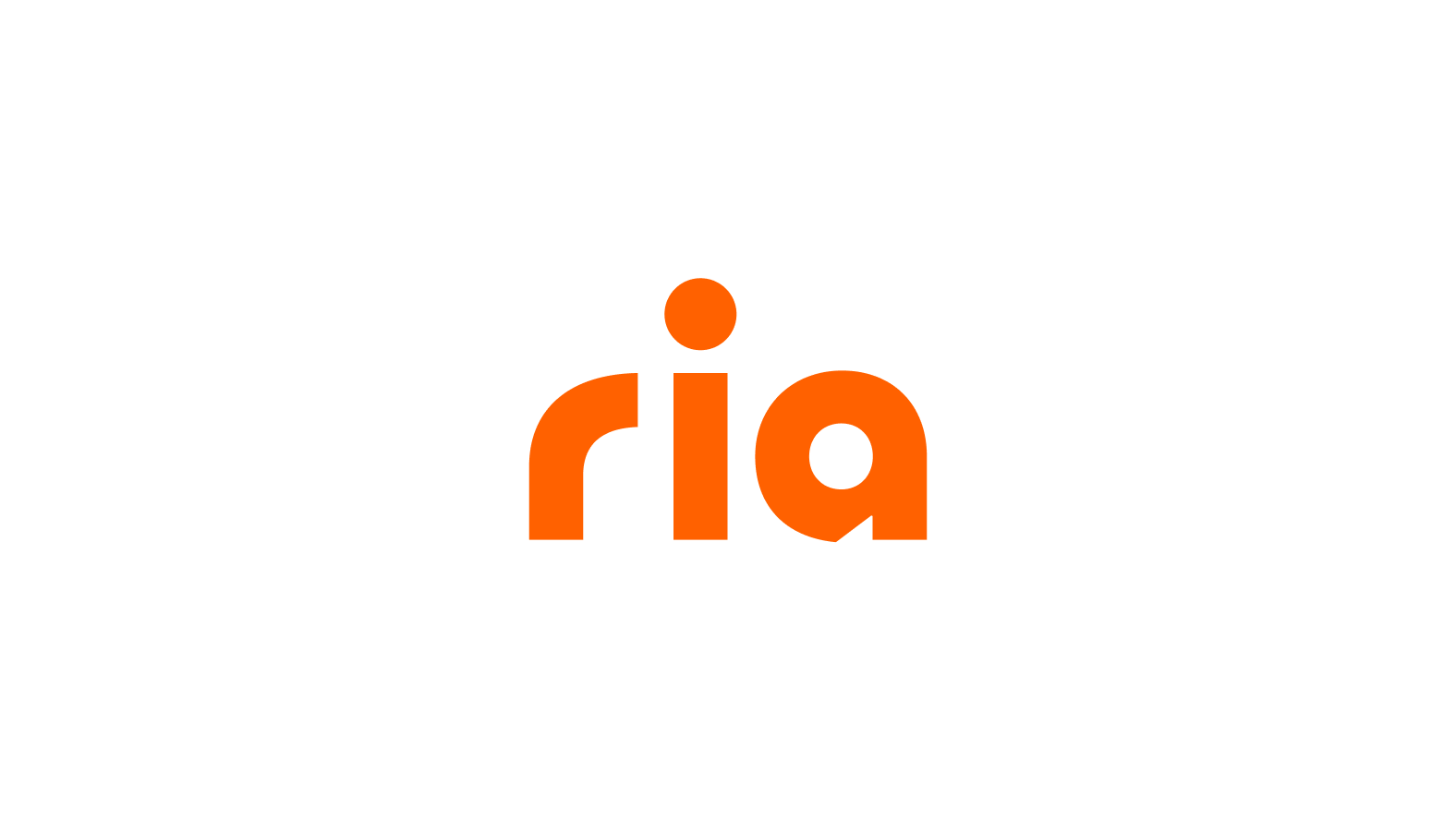
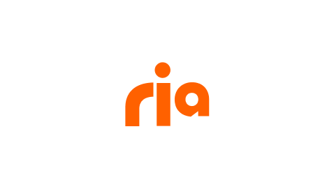
Primary logo
- With descriptor
The primary logo lockup with the descriptor should be used in situations where it is important to clearly communicate both the brand name and the business offering, when the audience is not familiar with the brand.
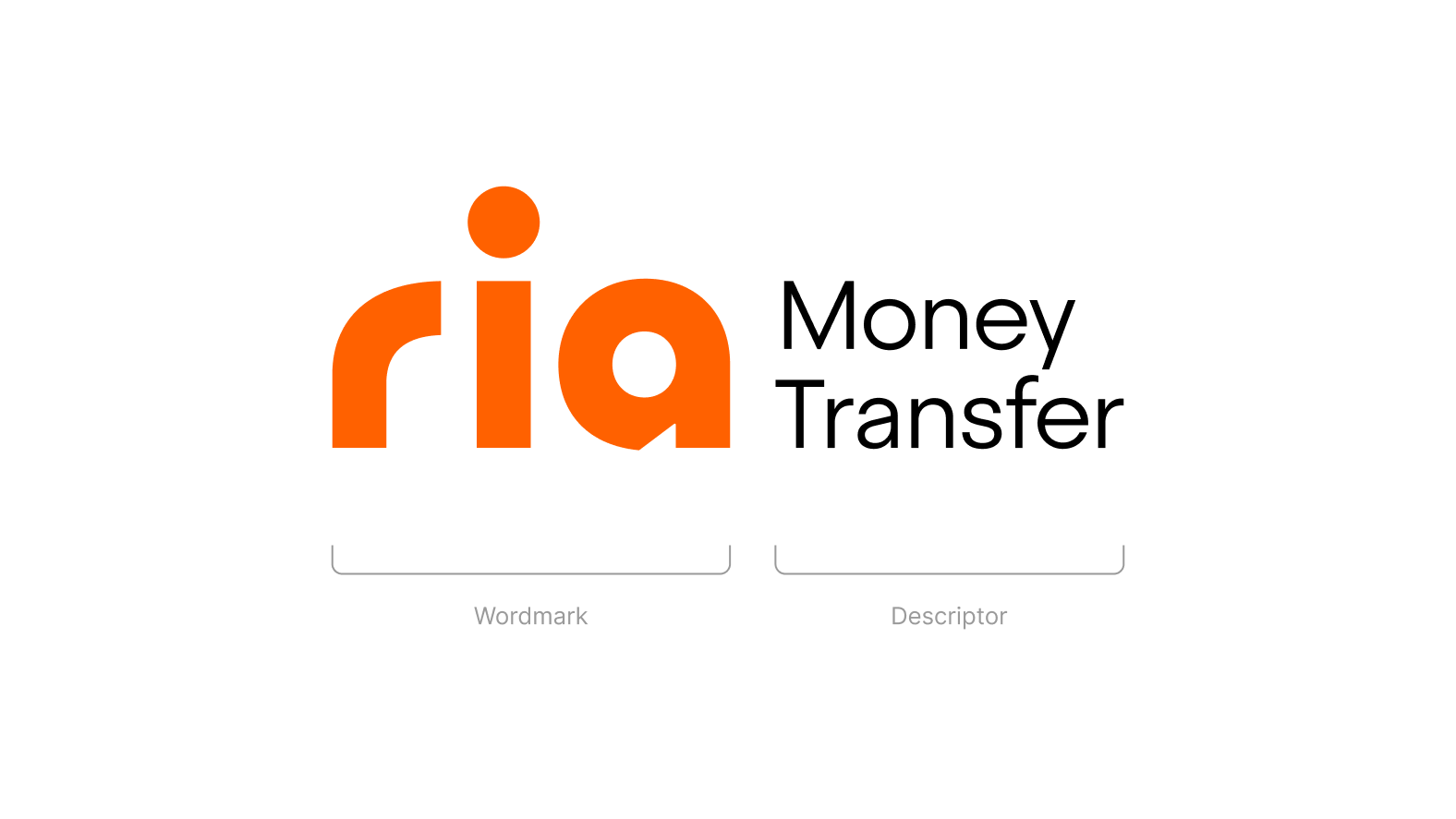
- Without descriptor
The primary logo lockup without the descriptor should be used when the audience is already familiar with the brand.
Secondary logo
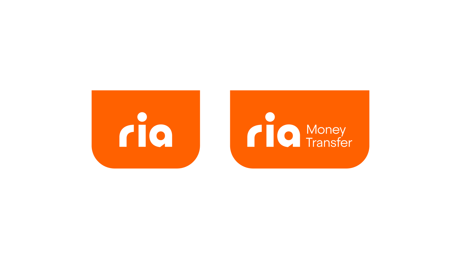
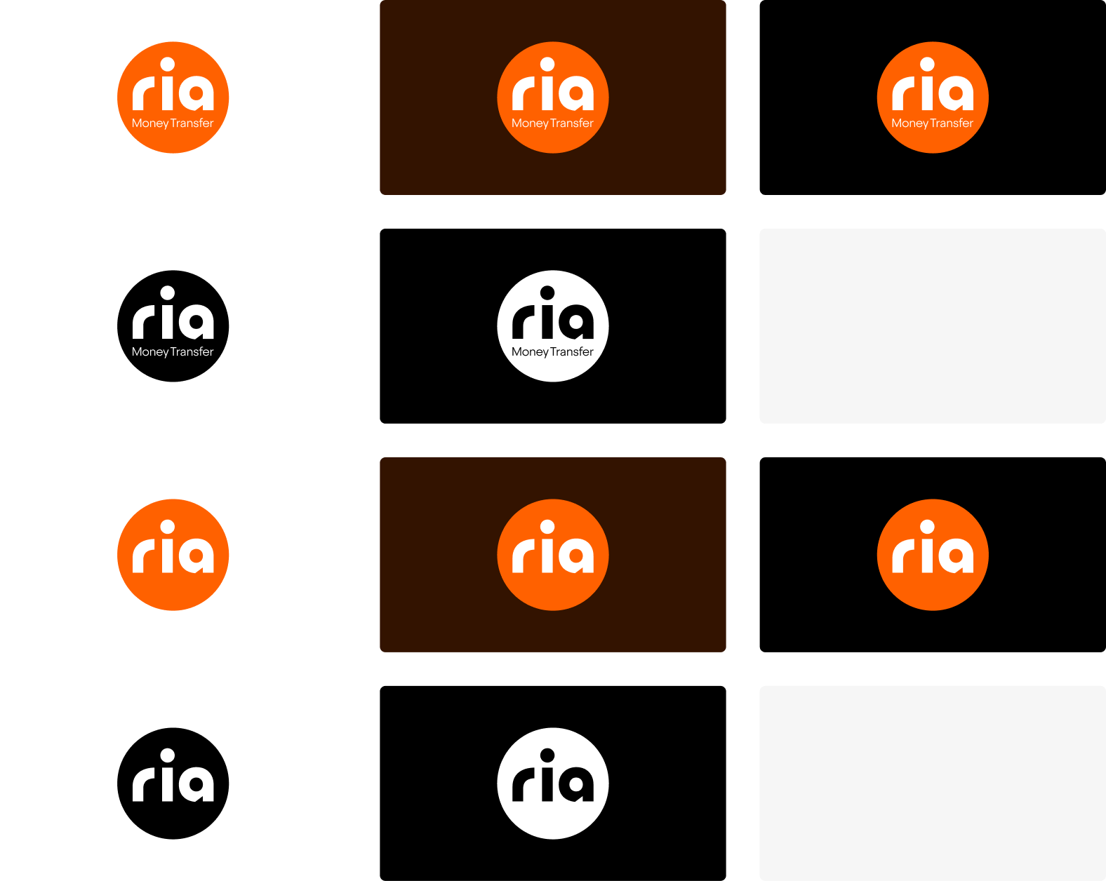
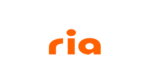
- Disc
The disc should be used when layouts are more dynamic and there is less real estate on the application to place the logo.
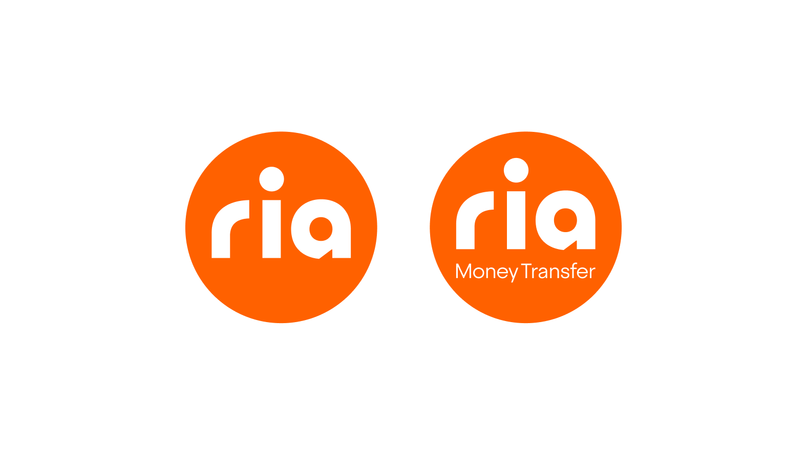
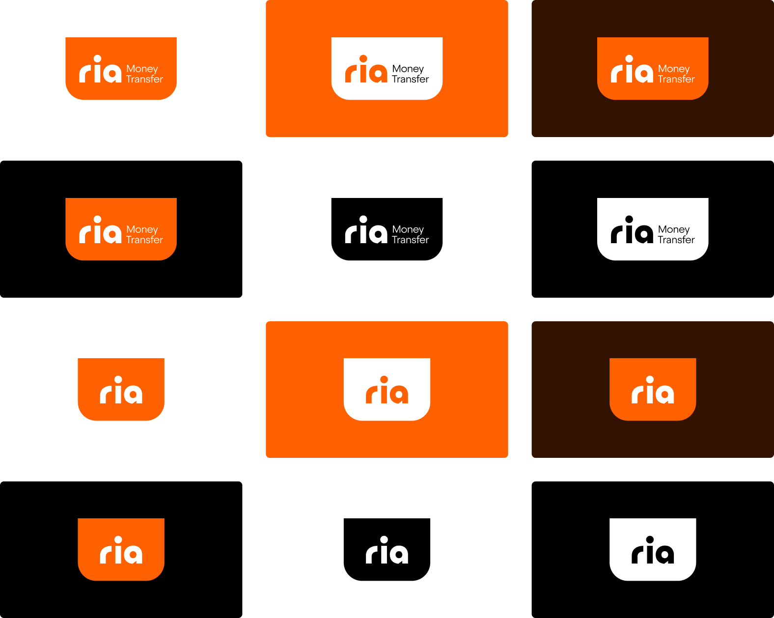
- Tag
The chip is designed to enhance brand recognition and recall when the audience is not aware of the Ria and its services.
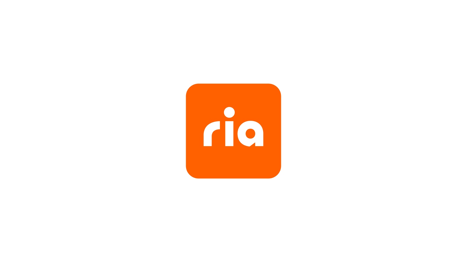
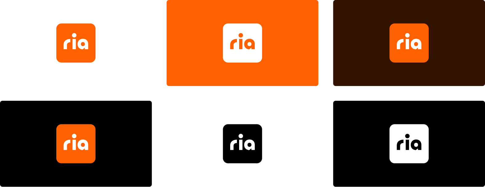
- Chip
The symbol is typically used to showcase the app or the brand in the most minimal way.
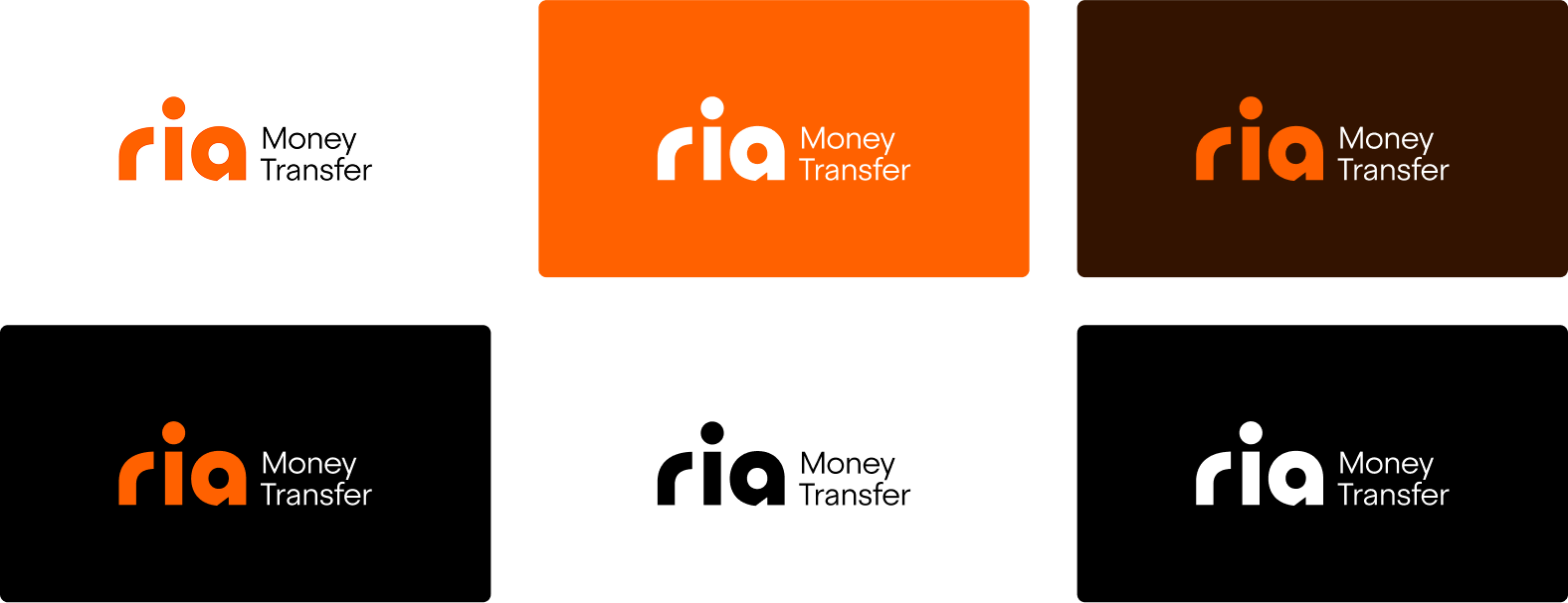
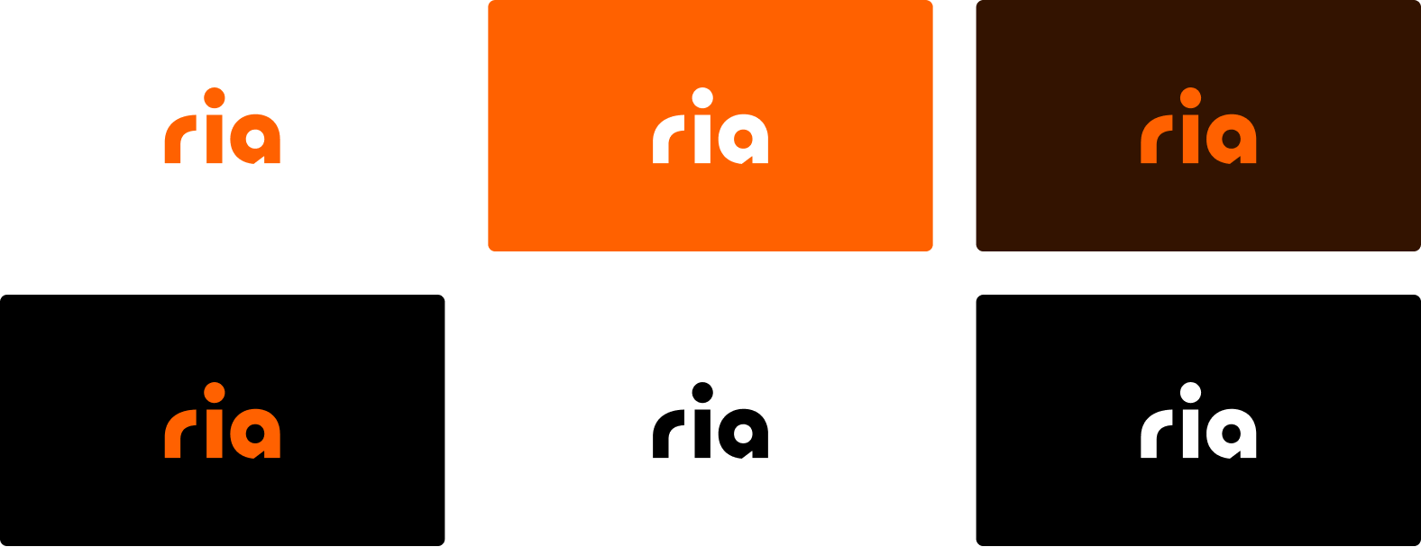
Logo colors
Primary logo with descriptor
Primary logo without descriptor
Secondary logo — Disc
Secondary logo — Tab
Secondary logo — Chip
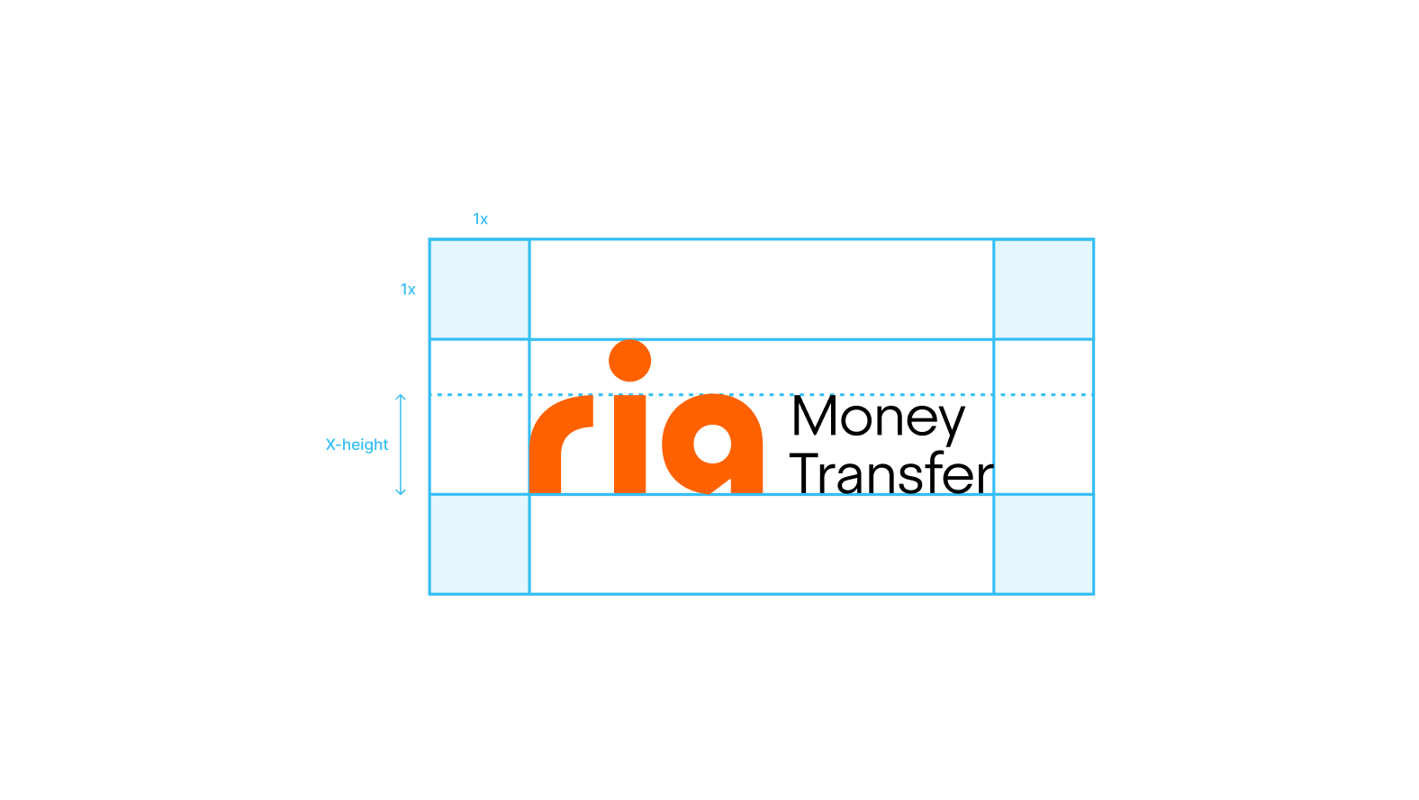
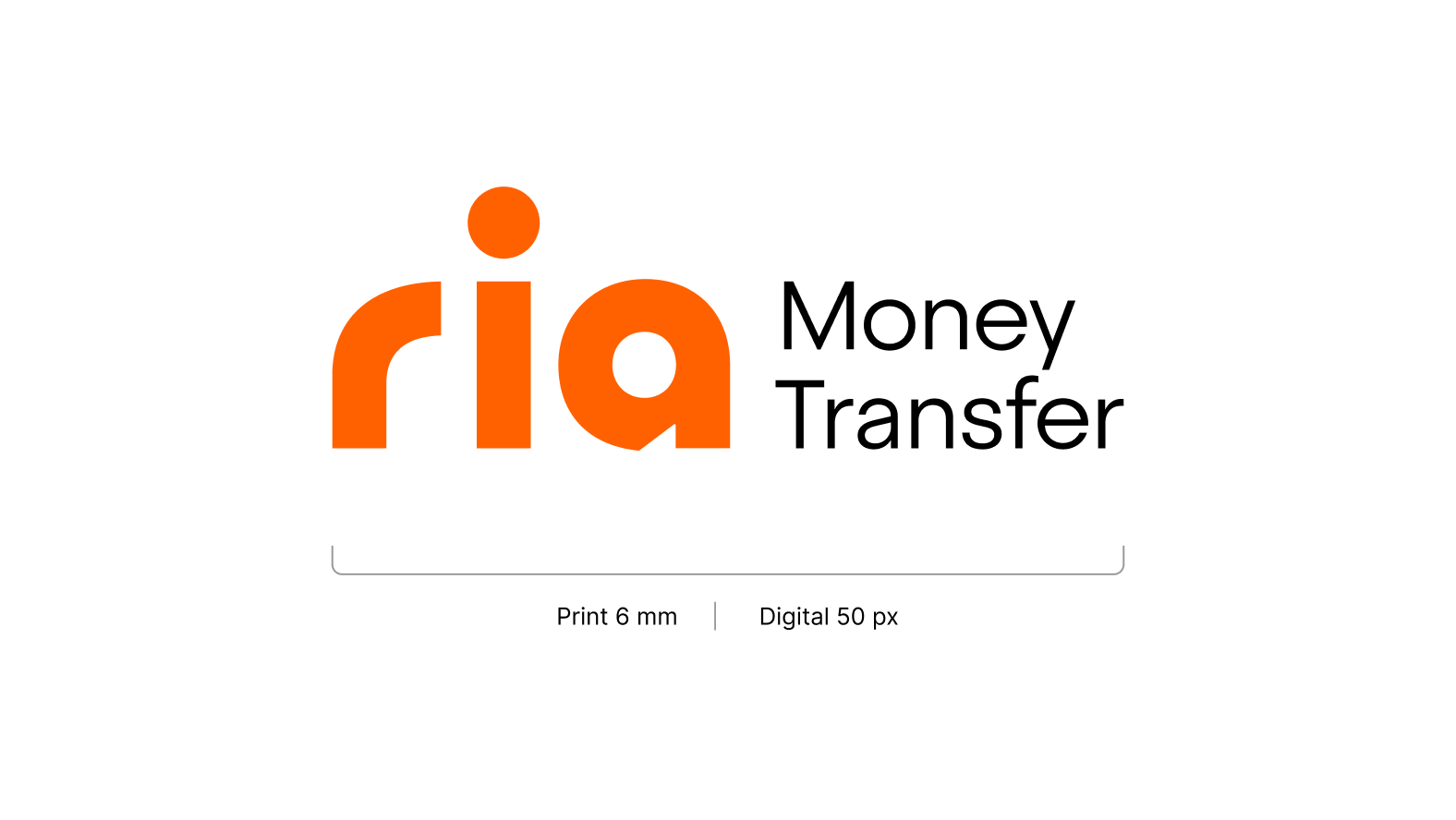
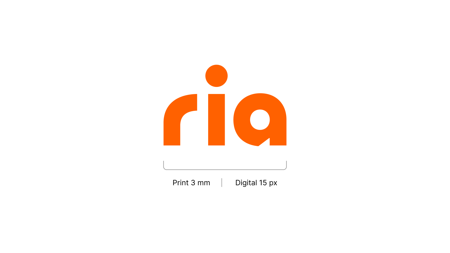
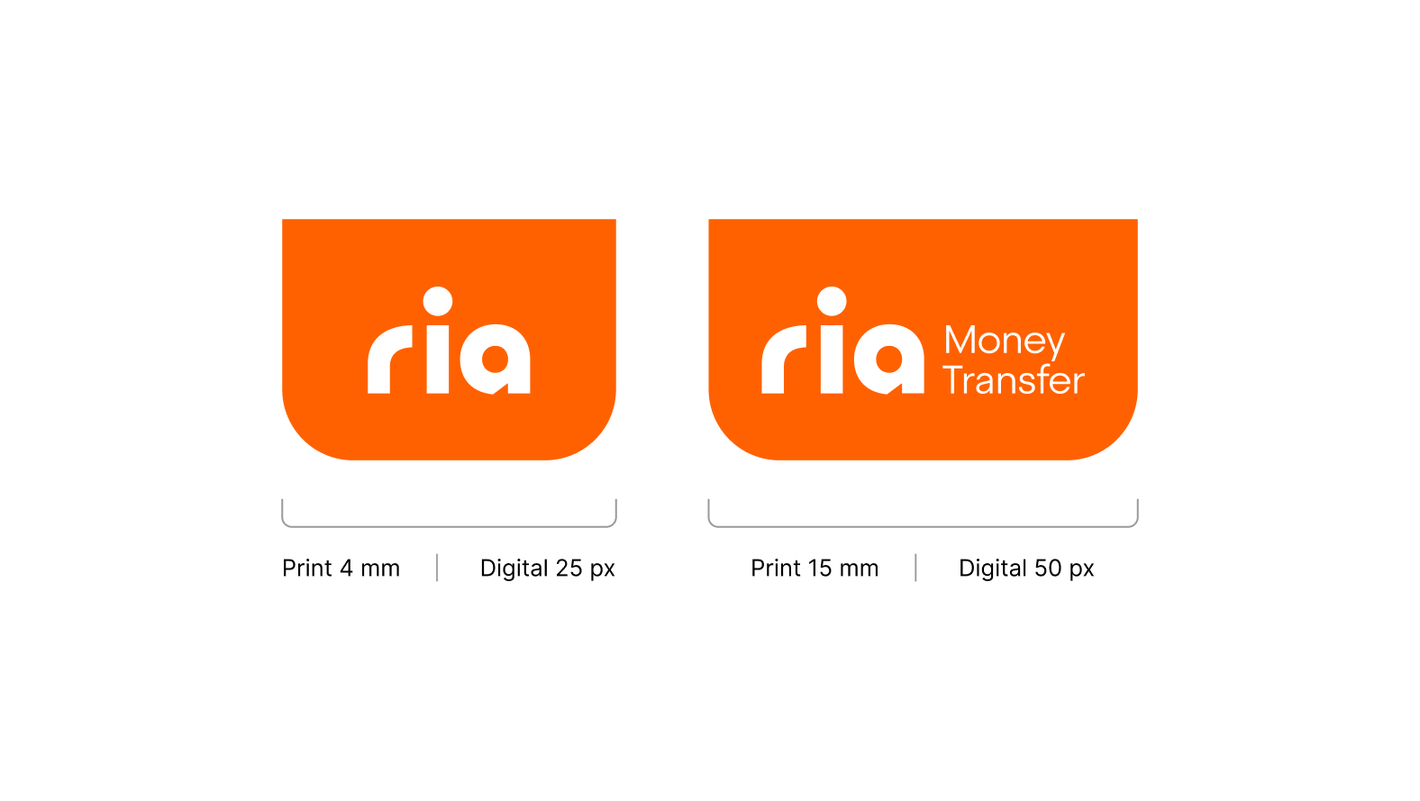
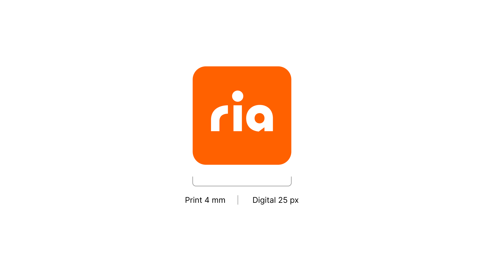
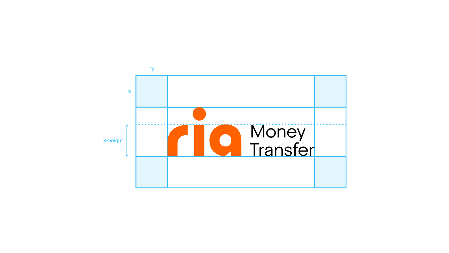
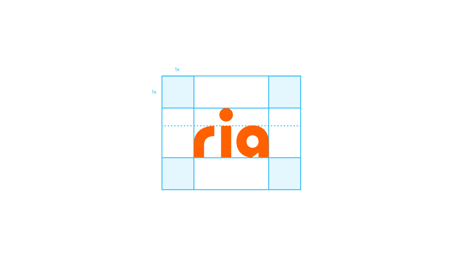
Clear space
Clear Space is the minimum required space around the logo for good visibility and impact. No design elements should intrude into the outer grey rectangle indicated below. Maintain a clear space surrounding the logo equal to the x-height of the wordmark on all sides.

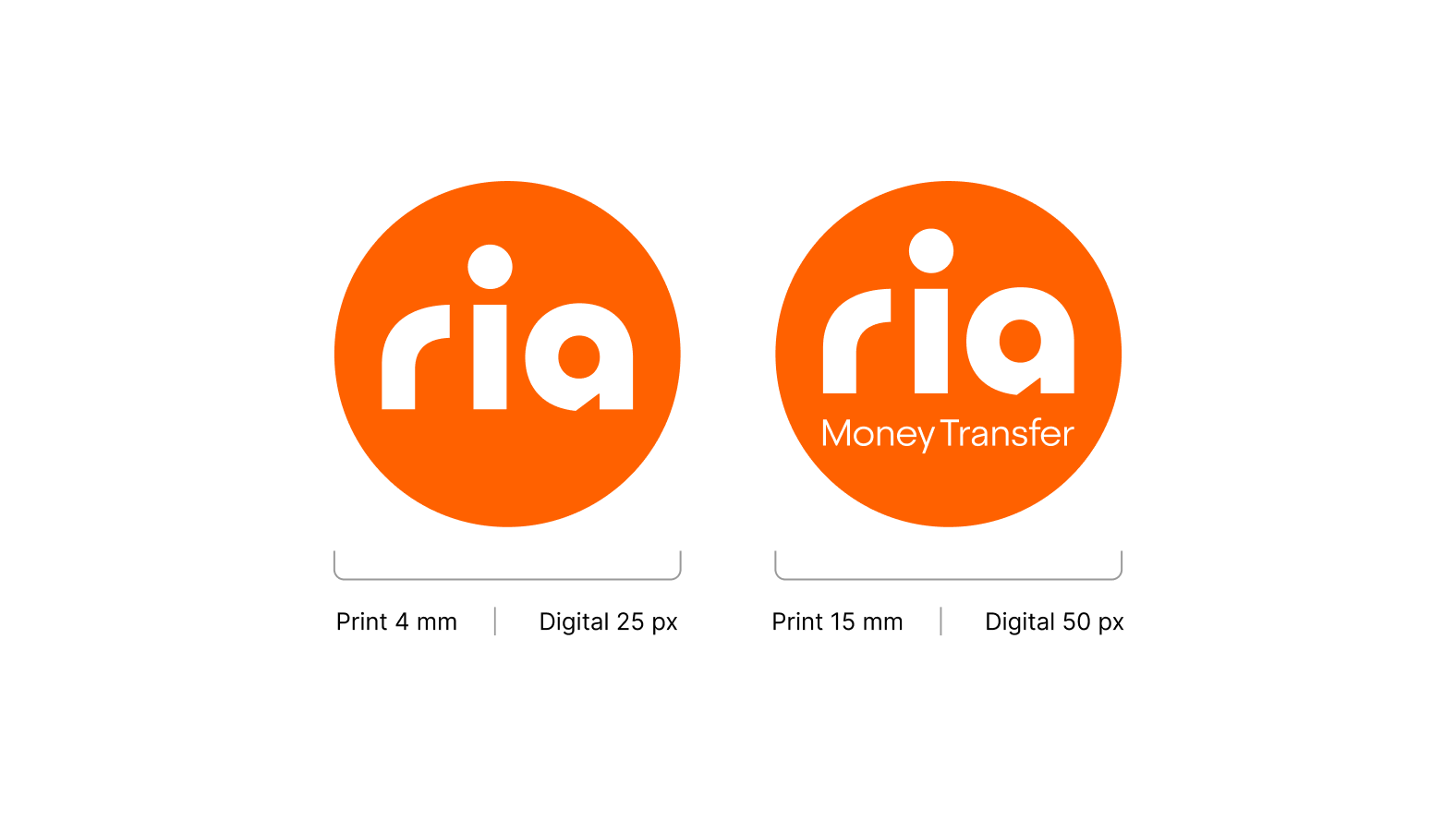
Scale
Primary logo with descriptor
Primary logo without descriptor
Secondary logo — Disc
Secondary logo — Chip
Secondary logo — Symbol
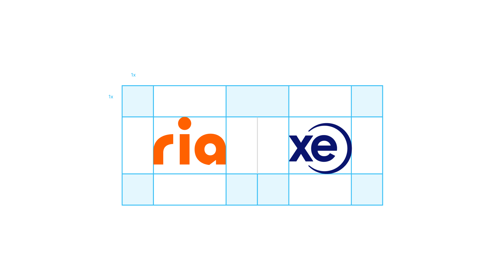
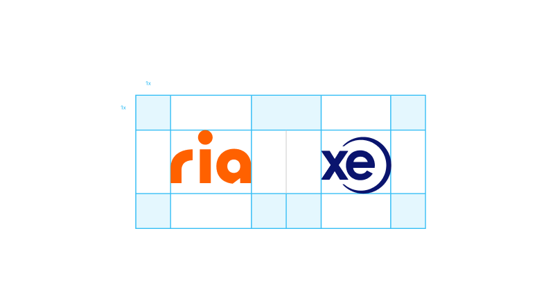
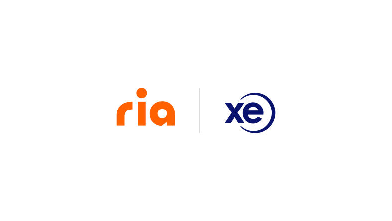
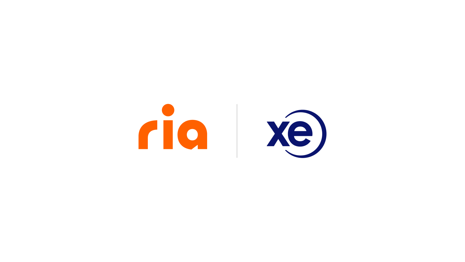
Partnerships
When both partners have the same level of importance, whenever possible, the Ria logo should be placed before the partner logo.
Incorrect usage
Don’t alter the logo. Avoid the following treatments.
Don’t outline

Don’t change colors
Don’t add any effects
Don’t change orientation
Don’t scale akward
Don’t change proportions
Don’t type out the logo

Don’t use on images directly

Don’t use the logo as a mask
© 2025 Dandelion Payments, Inc. All Rights Reserved.
v1.0
Logo
The Ria logo is our key asset and, above all other design assets, the most recognizable. It balances simplicity for good legibility, personality to create recognition and boldness to live in a wide variety of environments.
Download logos

Primary logo
- With descriptor
The primary logo lockup with the descriptor should be used in situations where it is important to clearly communicate both the brand name and the business offering, when the audience is not familiar with the brand.
- Without descriptor
The primary logo lockup without the descriptor should be used when the audience is already familiar with the brand.
Secondary logo
- Disc
The disc should be used when layouts are more dynamic and there is less real estate on the application to place the logo.
- Tag
The chip is designed to enhance brand recognition and recall when the audience is not aware of the Ria and its services.
- Chip
The symbol is typically used to showcase the app or the brand in the most minimal way.
Logo colors
Primary logo with descriptor
Primary logo without descriptor
Secondary logo — Disc
Secondary logo — Tab
Secondary logo — Chip
Clear space
Clear Space is the minimum required space around the logo for good visibility and impact. No design elements should intrude into the outer grey rectangle indicated below. Maintain a clear space surrounding the logo equal to the x-height of the wordmark on all sides.
Scale
Primary logo with descriptor
Primary logo without descriptor
Secondary logo — Disc
Secondary logo — Chip
Secondary logo — Symbol
Partnerships
When both partners have the same level of importance, whenever possible, the Ria logo should be placed before the partner logo.
Incorrect usage
Don’t alter the logo. Avoid the following treatments.
Don’t outline
Don’t change colors
Don’t add any effects
Don’t change orientation
Don’t scale akward
Don’t change proportions
Don’t type out the logo
Don’t use on images directly
Don’t use the logo as a mask
© 2025 Dandelion Payments, Inc. All Rights Reserved.
v1.0